Showing posts with label IFI7159. Show all posts

Sunday, January 5, 2014

Foundations of Human-Computer Interaction - Book Review - The Design of Everyday Things by Don(ald) Norman

Don Norman is a Computer Scientist, Electrical Engineer, a Doctor of Psychology and a professor of Human Centered Design. He has written The Psychology of Everyday Things (later The Design of Everyday Things) to deal with frustration: the frustration of being unable to operate the most simple of devices. This inability, Norman realized, was not a consequence of his own perceived stupidity, but was a consequence of bad user interfaces, in other words, bad design.

In The Psychopathology of Everyday Things, Norman discusses that objects shouldn't need instruction to be usable. Interfaces should have visibility, that is, we should be able to see what an object is capable of. These visible messages are natural signals and the design that takes advantage of those is natural design.
Natural mapping is an expansion of the concept of mapping, a direct relationship between what is perceived as possible and intention. Natural mapping uses physicality and culture as guidelines for those mappings, making this relationship understandable.
Affordances, without a doubt the most interesting concept discussed in this chapter (and maybe the book) are properties of a given object. They describe what is possible to do with an object and are the attributes that make objects tools: they give purpose. Constraints on the other hand are like anti-affordances: they describe what we cannot do with a given object or the limits of what we can do. Putting all of these concepts together gives us conceptual models, the mental image of an object, all you can and cannot do with it and the relationships between intention and possibility.
He concludes saying that designing for people is all about making good conceptual models (therefore, understanding mappings, affordances and constraints) and making things visible.

In The Psychology of Everyday Actions we learn the 7 stages of action: forming a goal, forming an intention, specifying an action, executing an action, perceiving the world, interpreting its state, evaluating the outcome; rinse, repeat. We also learn of the two Gulfs, the gulf of execution, the distance between the intentions of the user and the actions possible with the object (see mapping) and the gulf of evaluation, the distance between the physical (visual, perceptual) presentation of the object and the intentions of the user (see visibility, affordances).
Norman also speaks of naïveté through Aristotle, mentioning that we tend to hold very simple, and often wrong, explanations for the phenomena around us. Coincidence leads to perceived causality, making us see relations between actions and results when they are not there. He also discusses silence, the insistence in not reporting errors that we believed are caused by ourselves. This conspiracy of silence leads to helplessness, the perception that we are simply unable to complete a task. This can lead to its own cycle, of taught helplessness, where we generalize our inabilities (and our fear of discussing them) leading to the habit of not trying, which leads to a self-fulfilling prophecy (you prove your own perceived inability by failing to even try to succeed).

Knowledge in the Head and in the World is about memory. Memory in the head is that efficiently, easily retrieved knowledge that we acquire by learning. Memory in the world is information like mappings and reminders, the information that is external to us but, after retrieval (seeing, hearing) and interpretation, becomes content that we can also use to act.
These two types of memory allow us to have precise behavior without precise knowledge:
- We don't need all the information to be within our heads, we can retrieve it from the world.
- Precision is unnecessary; as long as we have enough knowledge to distinguish right from wrong, so we can interpret the external information to complete a task.
- The world limits possible actions through natural constraints, so we do not need to know all that is possible/impossible, we can infer through interaction
- Additionally, cultural constraints are carried with us through learning, so we know what is acceptable to do with a certain object.
A design model is the ideas of the object's designer on what can and cannot be done with it. A user's model is that which the user develops through observation of this object and a system image is the totality of information available on a given object (affordances, constraints, instructions, appearance). In an ideal world, the design and user model are identical. The system image should also perfectly align the appearance and instruction set of an object with the real affordances and constraints of an object.

Knowing What to Do expands on constraints by attempting to assemble a Lego motorcycle: physical constraints are true limitations of size, weight, mobility; semantic constraints are limitations based on meaning (the windshield goes in front of the driver, the driver points forward, etc); cultural constraints are about accepted conventions (the red light means stop, goes in the rear; text is to be read, so it must be right-side-up, etc) and logical constraints are limitations in logic (all bike parts must be connected to work, no parts can be missing, etc).
Constraints are as important as affordances to tell us what to do. If constraints are deceiving, we are unable to understand what is really possible with an object. If you can perceive more than one possibility from a single part, you are a victim of bad mapping.

To Err is Human is about making mistakes. The most common type of error is a slip, when we end up doing something when we intended to do another thing. Slips can be capture errors (two sequences start the same and you unconsciously move from one to the other), descriptive errors (we confuse two look-alike objects and do to one what we should do to the other), data-driver errors (we retrieve wrong data and work on this equivocal information), associative activation errors (the event gets a similar, but wrong, response), loss-of-activation errors (we forget what we were doing mid-action) and mode errors (objects with several available modes are used without first selecting the correct mode).
Good design uses feedback to prevent or warn about slips by showing there was a discrepancy between intention and result. 
Different levels of complexity are acceptable for different types of tasks:
- Deep tasks cannot be wide, but shallow tasks can (there can be many flavors of ice-cream to choose from without risk).
- Narrow tasks can be deep, but wide tasks can't (when cooking by following a recipe, there can be many steps because there are very little decisions to be made).
Good design deals with human error by understanding and minimizing causes for error, making it possible to undo actions, making errors easy to discover and fix and understanding that tasks are imperfect simplifications of users actions. And if all else fails, designers should resort to locks (forced sequences that prevent users from making mistakes).

The Design Challenge is about designers as human beings. We are at a constant balance between usability and aesthetics and the iterative process of design, analyse for errors and modify (repeat until time/budget/resources run out). We also have limited mental resources and cannot predict everything. Our attention is too focused and too limited. We also are not end users, and most of the times, neither is our client. Lastly, we have a tendency to ignore convention in the name of innovation, sometimes breaking affordances and constraints.
We must also accept that sometimes there are no perfect answers and the best solution is a balance.
Last but not least, the most common design sins: complex is cool or the worshiping of false images and creeping featurism, adding more and more features that add more complexity than utility.

User-Centered Design, the final chapter, is about the philosophy of good design. The chapter revisits every chapter of the book in order to posit what good design actually is.
A good design makes possible actions clear, makes everything visible (actions, results and the conceptual model itself), makes evaluation easy and follows natural mappings between intention and action, action and result and visible information and interpretation. It uses both knowledge in the world and knowledge in the head, it simplifies structure, it bridges the gulfs of execution and evaluation, it gets mappings right, it exploits constraints and it allows for dealing with error.

This was the first time I've read The Design of Everyday Things since my early days of Industrial Design college in 2007. It is one of my two favorite books by Don Norman, together with Emotional Design. Contrary to the opinion of most of my Industrial Design colleagues, I do not think this book is offensive to the profession, but rather a fantastic guide of good, human-centered design. Designers should be less egocentric and understand they are not artists, they are craftsmen who trade in human needs and whose handicraft are useful objects. Re-reading this book made me decide I must read something else Norman wrote between these two of my favorite books, probably Turn Signals are the Facial Expressions of Automobiles.

Foundations of Human-Computer Interaction - Final Concept Map, A.K.A. The Behemoth.

This thing is huge.
Gargantuan.
Confusing.

H. P. Lovecraft would write about it, terrorizing Rhode Island, domineering the Ancient Ones.

Cthulhu has nothing on The Behemoth.

I present thee "The Integrated Concept Map for Foundations of Human-Computer Interaction"

he com̡e̶s, ̕h̵i​s un̨ho͞ly radiańcé destro҉ying all enli̍̈́̂̈́ghtenment, concepts lea͠ki̧n͘g fr̶ǫm ̡yo​͟ur eye͢s̸ ̛l̕ik͏e liq​uid pain,  can you see ̲͚̖͔̙î̩́t̲͎̩̱͔́̋̀ it is beautiful t​he final snuffing of the lie​s of Man ALL IS LOŚ͖̩͇̗̪̏̈́T ALL I​S LOST  he comes the ich​or permeates alMY FACE NO NOO̼O​O NΘ stop the an​*̶͑̾̾​̅ͫ͏̙̤g͇̫͛͆̾ͫ̑͆l͖͉̗̩̳̟̍ͫͥͨe̠̅s ͎a̧͈͖r̽̾̈́͒͑e n​ot rè̑ͧ̌aͨl̘̝̙̃ͤ͂̾̆  H̸̡̪̯ͨ͊̽̅̾̎Ȩ̬̩̾͛ͪ̈́̀́͘ ̶̧̨̱̹̭̯ͧ̾ͬC̷̙̲̝͖ͭ̏ͥͮ͟Oͮ͏̮̪̝͍M̲̖͊̒ͪͩͬ̚̚͜Ȇ̴̟̟͙̞ͩ͌͝S̨̥̫͎̭ͯ̿̔̀ͅ

You have been warned.


Foundations of Human-Computer Interaction - Module 7 - History and Vision

I tried very hard not to use a timeline structure... and failed. I guess I'm hardwired to think of History as linear. One of those things David calls my tendency of being too aseptic, I guess.
It was very cool to revisit this timeline in my head, as I've written extensively about the oN-Line System (NLS) and Doug Engelbart's unsung parenthood of so many things we now take for granted in Human-Computer Interaction: the pointer, the collaborative document, tele-conferencing, hypertext etc.
So here it is, in a timeline-ish shape, the final Concept Map before integration:

Sunday, December 29, 2013

Gary Hustwit's Objectified, reviewed by the three of us: Gabriel, Antra and Eduardo

“Good design is honest”
Even though “Objectified” focuses in Industrial design, it was interesting to see rules, concepts and models we studied in the course and that apply to design in general being mentioned many times by interviewees. Visibility was discussed many times through the film with sentences such as “Good design is honest”. Designers from the film logically didn’t mention visibility directly, but talked about it in many ways.


For most of them, a good product design has to show to users what they are suppose to do with it. The product or object has to be “honest” enough to put forward its main affordances in a visible way. And is not an easy task to do so. Another sentence that called my attention was that well-designed objects have to “feel almost undesigned”. The better the design, less explanation needed to make users understand its functionalities.

By watching the film, I remembered my childhood when we were suppose to help our parents to install any kind of new electric device in the house. TVs, CD players, washing machines, ovens, microwaves, fridges, whatever - it was always a pain to understand how it should work. Companies sent (and still do) huge manuals on how to install/use their products in its package. But why would a logical object (even a complex one) need 500 pages of manual? A well-designed one most likely would not.

“ When I started I found out that the most important thing for designers would be to go to the environment, look at people and think about how they experience products as a source of inspiration”

This sentence was fundamental for me to understand how any design needs to be tested with users to understand if it works or not. By paying attention to how people react to our product (being physical or digital), we can understand what is not working, where is it missing to give them a feedback, what kind of false affordances we are showing, etc.

Most importantly, at this moment I also made a connection between Human Computer Interaction and Crossmedia Production. As content producers, an important step of the production of our projects is to go out of the building and test it with our target audiences. How do they react to that specific scene? How funny it was that line? In both cases, having ideas in our heads is something great, but we should also test them in order to understand how right our assumptions were.

Different opinions, different paths for success

Another thing that called my attention in the film was the diverging opinions on how to create good design. For instance, I remember in one part of the film I guess it was Anthony Dune who said that “my job is about what is going to happen, not about what already happened”. Nevertheless, most of the other designers seemed to agree (and I also agree with them) that design is also about what already happened.

As we learned in the course, a designer being industrial, interaction, product or graphical designer, has to take into consideration users’ cultural background and knowledge when in the creative process. Of course, innovation is a key to success and we shouldn’t be afraid to try it out new concepts or new ways of dealing with a design, however, it is also necessary to think why things work this way and if there is a problem with it or not. Otherwise, it can happen that we start changing features that we shouldn’t touch when designing something that already exists.

Anthony Dune, on the other hand, is a famous and successful designer. He probably takes into consideration consumers’ cultural background when designing his products. But what he means is most likely tha innovation is very important in his work and what defines a good designer. In this sense, I also believe that it is the only way for us to move forward as a global society.


Some thoughts about Apple and design

We all agree that things have to be clear and understandable. Even nowadays the arbitrariness and thoughtlessness in which the things are so often brought to market is shocking. We read the 1988 book “The Design of Everyday things” by Donald A Norman, and were arguing if maybe the three decades with industrial production and ever-raising competition would have helped to fix this problem and a clean, user-friendly design would have became a must, but apparently, as the film argues, it is not yet the case. Why do we still have the chairs that are not comfortable to sit in? Why, instead of not using the GPS device with this totally user unfriendly interface, that would force the designers to make changes in the product itself, we are calling ourselves dumb instead? It is exactly the thing Norman was asking three decades ago, and this is the concern of good designers now.

“Good design is as little design as possible” - this sometimes interferes with the human factor of individual designers and companies. How to stand out? How to be innovative? How to be able to compete with others? Impress the investors and superior employees? This is where the film starts to talk about one company that has managed to stand out from day one. It’s Apple. The Apple designer guy explains how they got to be an industry-wide design example. They know how to use different attributes: material, form. They take into account how does the user connect to the product, what is the key interaction element. They have found out how to get the design “out of the way”. Unlike many many competitors out there, Apple products’ forms are not arbitrary shaped, but are there for a reason - this is where they start thinking about design. As the interviewee points out - design must be almost inevitable, the product should feel almost “undesigned”. 

The feature or part in the product is there only if it does something, that is necessary for the functioning. As a user of the new MacBook pro - I, for example, adore how they even took the “MacBook Pro” sign off the front, leaving the whole thing totally plain simple. They took off all the indicators, lights, everything that is not critical for use - and I did not even notice anything lacking from my previous Probook. Look at Apple keyboards - so simple it’s almost undesigned. But it leaves us with the certainty - this is exactly how it should be. My mother is freaking out when it comes to technology, and when it came to the point she needed a smartphone.. though I am not an Apple evangelist - iPhone was the logical choice.. For the simple reason of it being so “fool-proof” and intuitive, thinking of the user need prior to designing anything. A physical button on the side to switch between silent and ringer modes; its state indicated by red colour, that is not even a digital indicator - wait.. is there even any other way to do it?

“Design is a search for form. usually the hardest part is to remove, remove, remove. Bit by bit, everything that is unnecessary. That gets in the way of the maximum unity.”

Almost all our relationship with the device soon after we start to use it is formed by the interaction between us and what’s happening behind the screen, experience between us and the software. It has so little to do with the physical design. And this is where Apple has been shooting in the target since the early days. Taking all the unnecessary stuff out, and leaving the emotional part to the interaction designers, that create the experience and ease of intuitive usage.

Using this right approach from the start - and you hit the goal. The other companies tried this and that, and what happens now? More and more business-class laptops, for example, look exactly like Apple products. I was looking at the billboard recently and thought, why Asus does not get sued for being designed almost exactly like MacBook Air.

In the film, there was a question raised on designing things, that stand the challenge of time. It is kind of against what the consumer society idea leads us doing, as it is beneficial for the capitalism that we have things and we change them as often as possible. Where is the balance of a sustainable design then? How did Apple manage to create a design that does not “get out of fashion”, but still motivate us to change a phone to a newer version every year?

The film kind of answers to that. We tend to want new things. “new now”, “next now” kind of look. Very well knowing, that this “next” is not going to be “forever” as well. So the biggest task is to design each new thing in a way the previous one looks like “then”. And this is what Apple is doing pretty well without making the “then” things look miserable.

At the same time, we barely ever see Apple’s products piling up in the garbage. Why? Because they do not use lack of quality to motivate people buy newer and more powerful versions of the gadgets. They have discovered the magic of motivating the people with this “feeling” they need the freshest models, at the same time letting the old ones continue living their lives. In the hands of other people with less budgets, in the houses of parents and grandparents.. After all - it still works for maximum possible time.


Objectified is an amazing movie. Part of a trilogy on design that began with Helvetica using typography as a door to discuss graphic design and ends with Urbanized using cities as a view to urban planning and achitecture, Objectified sits in the middle, using our fetish for beautiful artifacts as a window into usability and industrial design.

Different cultures have different relations to the objects around them. Germans are pragmatic animals, obsessed with function, the French have an uncontrollable need for beauty, to the point of being kitsch, the Japanese are ritualistic beings with a very tactile relationship to objects etc. This reflects in the different approaches to design you see in the movie from designers such as Naoto Fukasawa, the Bouroullec brothers or Dieter Rams.

Speaking of Rams, the movie reflects his status as the father of good design by being filled to the brim with quotes from his ten principles. Those bear mentioning - good design is innovative, makes a product useful, makes a product understandable, is aesthetic, is unobtrusive, is honest, is long-lasting, is thorough (down to the last detail), is environmentally friendly and, last but definitely not least, good design is as little design as possible.

Rams' influence on Jonny Ive is left very evident and Ive is shown as his heir apparent, disciple and magnum opus. Ive's iron-grip on Apple's industrial design, reflective of Steve Job's iron-grip on Apple itself, gets special attention in the movie. Other new-school designers get equal attention: Karim Rashid with his flowing, almost liquid forms and his products that reach from the cheapest trash cans to the borderline objets-d'art, Marc Nelson's fluidic shapes that span from chairs and appliances to automobiles and airplanes and Chris Bangle, the American who took over BMW's design in the 90's (including MINI and Rolls Royce) after stints at Opel and Fiat.

Rams is not the only grand master featured in the movie. The super-studio IDEO (born in the 90's as the merger of Bill Moggridge's Moggridge Associates and ID Two and professor David Kelley's David Kelley Design) is shown as the superpower of American industrial design (even though Moggridge was actually born in the UK). IDEO is responsible for the first laptop, for Apple's first mouse, for Palm's PDAs and several non-electronic gadgets as well (its clients include PepsiCo, Ford and Procter & Gamble, among many others).

Although the movie makes a deep dive into the mind of the industrial designer as a professional and as an individual (showing the 'disease' that some of us feel, as very well exemplified by Jonny Ive, of obsessively overanalyzing other people's design choices and trying to guess at who their target audience was), it lacks something that both Urbanized and Helvetica have: conflict. While Helvetica uses the balance between modernism and postmodernism to lecture the spectator on good design and Urbanized pitches planned and organic urbanism against each other, Objectified misses the opportunity to pitch Rams' ten principles (especially being honest, environmentally friendly and long lasting) to the pressing forces of marketing to build in planned obsolescence and the constant push for consumerism. While it touches these points, eventually, it avoids making this a central point in the discussion.

This defect aside, Objectified is probably the greatest documentary on industrial design, especially from a designer's point of view, as it reminds us that every object, every tool around us has been designed by someone, for someone, to fill a certain need and complete a certain task, even if it was poorly so. It is a great service to the design community and it manages to be very entertaining while doing so. 

Friday, December 13, 2013

Sunday, November 24, 2013

Foundations of Human-Computer Interaction - Module 5 - Interface efficiency, KLM, GOMS

This module was filled with insights into my master's thesis. Maybe because my thesis is finally (!!!) materializing inside my head, maybe because it simply did have many concepts which bug me constantly, like the quantification of (in)efficiency of human-computer interfaces. But now I'm not only quite sure of what I am to propose as a thesis, but how to defend and quantify the results of the work.
Phew! Thanks Prof. Lamas! It must have been all that cheese bagel I had last week (just kidding, the meeting was great to solidify my ideas on tangible computing).
Without further ado, let's move to the concept map:

In this one I resorted a lot less to quantifications and special colors (maybe because the methods themselves are quite linear and self-explanatory, or maybe because they make sense to me).
Overall, this was a very information-dense module: lots of interesting things to learn from a rather small pool of key concepts. Good information efficiency, I guess!

Sunday, November 10, 2013

Foundations of Human-Computer Interaction - Module 4 - The Human Processor Model, Fitts’ Law


In building this map I had to resist very hard not to follow Card's design of a little user's head when positioning the elements. I am actually glad I did, because I could maintain my habit of aligning equivalent elements (with the exception of working/long term memories, which I had to push diagonally to fit the recognize-act cycle). I wound up using four color codes: light blue for most concepts, yellow for the recognize-act cycle, gray for figures (time, capacity) and green for principles of operation and their consequences.
Not the best map I've ever built, but I believe most concepts are well represented, even if some are left unnamed (I decided some principles of operation were more important for their effects and naming them would be overkill).

Sunday, October 27, 2013

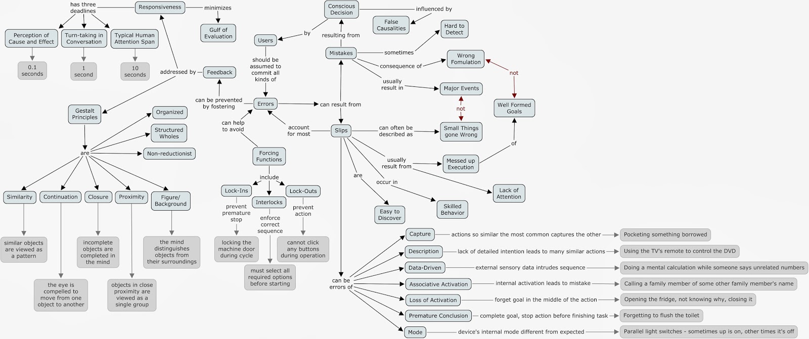
Foundations of Human-Computer Interaction - Module 3 - Feedback, Errors, Forcing, Gestalt laws, Responsiveness


This one was a doozy, especially because I had to illustrate each kind of error with an example. After I had come up with examples for each kind, I had to come up with a visual style to separate examples from main concepts, something I did using shades of gray instead of the usual black on light blue. Since I had gone through all the trouble to visually identify examples, I decided that I would use the concept in other places as well, and also illustrated the responsiveness deadlines, forcing function types and laws of Gestalt in the same fashion. It might make for an over-populated map, but no complex concept goes unexplained. In the end, I really liked the result, even if, in terms of graphical weight, it turned out a little bottom-heavy.

Sunday, October 13, 2013

Foundations of Human-Computer Interaction, Group Assignment 3: Design critique

Group Members: Gabriel Motta FerreiraAntra Balode, Eduardo Ferreira Fontes Mercer

Memory Sticks

I am about to talk about an issue that has bothering humanity for the past half decade. Its name is memory stick (or flash drive, or pen drive - depending on the country). It doesn’t matter how good you are with computers, you will always struggle trying to find out what side should your memory stick be to fit the computer USB input two to five times. But how come people have so many problems to find out the right position if there are only two (logical) options? Are we all still baboons trying to find our ways out of the cave (or into the cave, in this case)? Probably not...


There aren't many affordances in these objects speaking in a physical sense. Its design suggests users to either put memory stick to the USB whole or to take it out. However, USB entrance gives the limitation or constraint of only allowing one side to be fit in there. Now, because of memory sticks’ rectangular design, there are two logical options for being accepted it in the USB hole. By logical I mean that we can distinguish the sides visually and therefore, we have only two possibilities remaining. However, a lack of visibility and an exaggerated similarity between the two sides make it hard for users to understand what side is the correct one (and the incorrect one).

Its design also doesn’t allow users to create a conceptual model in their heads in order to deal with the product’s complexity. Maybe the problem comes from before memory sticks, as probably USB entrance is older than the object analyzed here, but its creators definitely did not consider the future users of memory sticks and their minds. It is an useful accessory many of us use many times in our daily lives. But as our attention is always turned to its digital use within computers, we often get memory sticks while looking at the screens and try to fit them somehow in the USB input with our minds somewhere else. Because of their shape, we randomly choose one side to try it out first and if lucky (never happened to me), we can successfully put it in the right place in first attempt.


fig. 1 - regular memory stick.


What usually happens is that users fail to put the stick on in the first attempt. Next, they turn the device to a second attempt. Maybe because users already have pre-defined in their minds conceptual models that they will fail many times trying to use memory sticks, maybe because there is another design error I am not aware of or maybe because of an ancient curse, the object usually also doesn't go in in the second attempt. So, often users keep trying to put memory sticks in USB entrances for several seconds (maybe even minutes, in more severe cases!) turning it around and around until it finally decides to ‘click’.

Apple’s solution


How to change a global design error that resulted in millions of frustrations? You can’t. Having a standard entrance as the USB one, doesn’t allow designers to come up with new bright ideas to solve the issue 100%. Nevertheless, Apple managed to reduce let’s say 50% of USB’s entrance problem by making it more visible which side is up. It is impossible to change the cable’s shape because it has to get into the hole, but it is possible to make a clean, white design with a simple sign indicating which side is up (duh!). This way, our everyday guy fails to put the cable in the USB whole in the first attempt, but from then one he sees the device and understands which is the right side, creating a conceptual model in his head due to visibility and getting rid of the old curse forever. 

fig 2. Apple’s USB solution


Old VS New train information displays in Riga Central Railway Station
Information displays in Riga central train station were changed around a year ago. Instead of the “old-school” displays (fig.1), new ones were set up. This is not a bad thing, as probably the whole system needed the digitalization and synchronization. The old billboards did an obviously good job in informing the passengers about what they need to know - that is - when is the next train to their desired destination, when is couple of others after that, and what is the current time at the exact moment. 


Fig. 1 - old schedule billboards in Riga Central train station. Departures

Right besides the central departures billboard, another one was located, that reflected the information about arriving trains (in mixed order, as for arrivals it is important to see if the exact train has arrived, not the next one from the same destination). 

Fig. 2 - old schedule billboards in Riga Central train station. Departures + arrivals

The new displays, shiny and bright, bring more confusion than joy to the Latvian Railway clients. The specifics of the train passengers in Latvia is, that they are mainly traditional, low-income, working class people, not familiar with technologies, not dynamic and take time to get accustomed to new systems and user interfaces. In spite of knowing that, the new system creators used another way of mapping, instead of modernizing the existing one. 

Fig. 3 - new schedule billboards

Firstly, all the trains are now listed in order of their departure, not depending on destination. That means, the passenger looses time browsing through a big list of trains, instead of directing his sight to one, certain place of the billboard, that he has been used to examine for years. The visibility is lost. A big part of the billboard is now taken by the train number, consisting of four numbers, that makes absolutely no relevance to a standard passenger, that raises question about the conceptual model and if it is thought out properly. The destinations in Russia are written in Cyrillic, assuming that the only ones traveling to Minsk and St. Petersburg are russians.

Now, the obvious need to compare the departure time with the current time, to see if you have enough time to go to your train, or maybe you have missed it, and it makes no sense to, say, run. This is challenging here as well, as the clock (on the left of the billboard) is mapped to show the current time, date and temperature outside. The data changes, each mode taking approx. 5 seconds. If I’m running to the last train, i do not care at all, what is the temperature outside. Or what date it is. I need to know, how many minutes and how many seconds I have till my train will leave the platform.

Visibility of the information in the new billboards is questionable as well - the choice of fonts is not up to date, the titles of the columns are small (especially for those, speaking English - in order to see what means what takes big efforts, and the passenger has to spend more time exploring the information grouping system than if the model, mapping and visibility would be sorted out correctly. I mean, they changed the thing in 2012, and both user interface designers and newest technologies are available without limitations.
Fig. 4 - Arrival billboards.

Where is the train arrival schedule now? Oh, somewhere in another hall, hanging there in a way you can actually notice it just from one particular angle (fig.3). So if you need to know when do the trains arrive, you can run around the whole big station hoping, that the billboard is somewhere...

Fig. 5 - just for fun. The billboard changing process. The signs on the screens say “Does 
Not Work”. Really? Here they DO care about visibility. :)

Latvian Railway versus Estonian Railway interactive train schedule tool

This is the Latvian Railway online, interactive tool for viewing train schedules. Instead of letting the user see when the train goes, and how much it costs to go from one point to another, we are presented with a rather complicated set of explanations and mapping. 

The departure and destination station drop-down menu is what I need, but what does the “interchange station” do there, as there is never more than one choice of interchanging the trains if they are served by two lines. The “erase” button makes it even more “colorful”. Date and time - OK. It is followed by information about extra fee for certain numbers of trains, because they are faster than others. I would never browse the train numbers to see if that’s the one I’m planning to take, that costs 0,20 sents more. There is no information about the standard price anyway, for that you have to press a separate link. Then comes a table of available trains. To be honest, passengers rarely care about train number, transport type and carriage type, it just makes the information messy and hard to consume. And then comes the best - explanations about some special cases and symbols in the schedule (that I have almost never seen). The green one is the trains with reduced ticket price (remember - the extra price was indicated in another, separate way above the schedule. The yellow one shows the trains with some operative changes for this and the following week. What changes? Are they there now, or will happen next week? What kind of changes? Confusing indeed. 


Pressing on a separate link, we can get to a user interface design and mapping “masterpiece” - an “interactive” map of the train lines. Basically it works for manually selecting the stations for the form I described earlier. Left-click on a station - it fills the departure station form, second station user clicks on - arrival station, third time -interchange station. It took some time for me to figure out, how that works, and what changes after my clicking, and what is it for. There is even a “manual” beneath, showing you can also right-click, getting the “context menu”, that practically means you get access to “station information” and “station picture”, none of them has content in any of the stations. In addition, only part of the stations are clickable at all, without any explanation of which ones and why not others. Plus, the map contains some train lines that do not exist anymore, even physically. 

As a contrast example - Estonian Railway online scheduling solution in elektriraudtee.ee website. It is important to note, that for some reason the website was not available neither in English or Russian at this moment, that would be the languages I understand, so I was using Estonian version. And no word of a lie, I did not have to spend an extra second for hesitation about what buttons to press and where does each bit of information lead to. That is what good conceptual model means. The very home screen of the website offers me to choose the destination and date, one simple button leads me to as simple results - time at the departure stop, at the destination stop, which direction to take. If I am interested in more details, as price and time in each station, I logically press on the link provided on the route, and get to a nicely made table with all the necessary information. 


Windows 7 versus Windows 8

The new Windows 8 'Modern' UI follows a design language Microsoft has been experimenting on since the nineties, based on typography instead of icons. It takes inspiration from the Swiss Style of graphic design and from signage typically found at public transport systems. Though previous incarnations of this design language have received accolades from experts such as the Industrial Designers Society of America (IDEA), it had yet to be tested on a desktop operating system, where the WIMP (Window, Icon, Menu and Pointer) design language has been the dominating paradigm since the introduction of the Macintosh in the eighties. This is, in a sense, the first instance of an operating system making use of a noncommand or post-WIMP interface.

Windows 7, a typical WIMP interface


Compare the screenshot of Windows 7, above, with that of multitasking on Windows 8, below. In the image above, you have different overlapping windows, a desktop full of icons and a taskbar sporting a main menu (the "Start" menu, symbolized by the Windows logo), icons for running applications and a notification area.  In the second image, you see three concurrent tasks "snapped" together side-by-side, each occupying all of the vertical space and different portions of horizontal space.
Windows 8's 'Modern', post-WIMP interface


Although at first glance you might judge that the non-overlapping windows on Windows 8 afford greater visibility, focusing on the data, you soon discover that unlike its predecessor Windows 8 actually hides all extraneous commands. This creates an environment free of affordances, where the user is unable to see what options are available without resorting to gestures like moving the pointer to a corner of the screen or sliding your fingers from the border of the touchscreen to call up a list of 'charms', as seen in the screenshot below:

Windows 8's Start Screen and a list of 'charms' called by sliding from the right

Another problem with Windows 8 can be illustrated by comparing the screenshot of the new Start Screen above with the montage of Start menus below, which groups shows the evolution of the concept from Windows 95 all the way to Windows 7. The move from an ever-present, hierarchical menu to a hidden, flat and animated full-screen presentation of 'live tiles' breaks with the established conceptual model built from eighteen years of user experience on previous versions of Windows and other WIMP-based interfaces.
Evolution of a conceptual model

This analysis concludes that, even though Windows 8 gets a lot of things 'right', it fails to live up to the expectations of users, making for a painful transition and an overall poor user experience, instead of building up on years of mutually reinforcing design principles. In that sense, Windows 7 gets the better hand on the balance between a clean interface focused on data consumption and a familiar interface with greater visibility and affordances.

References:

Gentner, D., and Nielsen, J.: The Anti-Mac interface, Communications of the ACM 39 August 1996.
Nielsen, J. Noncommand user interfaces. Communications of the ACM 36 April 1993.
The Windows Interface: An Application Design Guide. Microsoft Press, Redmond, Wash., 1992.Norman, D.A. The Design of Everyday Things. Basic Books, New York, 1988


Foundations of Human-Computer Interaction - Module 2 - Seven stages of action, Types of knowledge


Concept Map - Click to enlarge

This was a complicated map to draw, firstly because I had a hard time, at first, to represent the cyclic nature of the seven stages, then where to derive the cycle to represent the gulfs of execution and perception. Another challenge was connecting the two maps (Seven Stages and Types of Knowledge) as a single one. The second map flowed a lot more naturally, even though it looks more convoluted than the simple circular nature of the first one. It was quite interesting to map these concepts and it helped me make more sense of them as a system.

Sunday, September 29, 2013

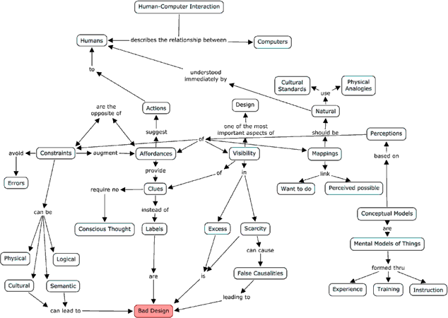
Foundations of Human-Computer Interaction, Module I - Visibility, Affordances, Mapping, Constraints, Conceptual Models

Just a little conceptual map I did with CMapTools for the first module of IFI7159 - Foundations of Human-Computer Interaction:


I know it's not some sort of masterpiece, but I promise I'll keep improving on it!